The Per Rewrite Diaries: Day 48
Posted on by Angelo Stavrow
This post is part of a series about rewriting my iOS app, Per. Per is a price per unit comparison app with a bunch of neat convenience figures, but it hasn’t been updated in years, so I’m rewriting it from scratch to eliminate a bunch of technical debt. Just because it’s not an open-source app doesn’t mean I can’t share what I learn as I go!
See the rest of the series here.
Safe Area Insets
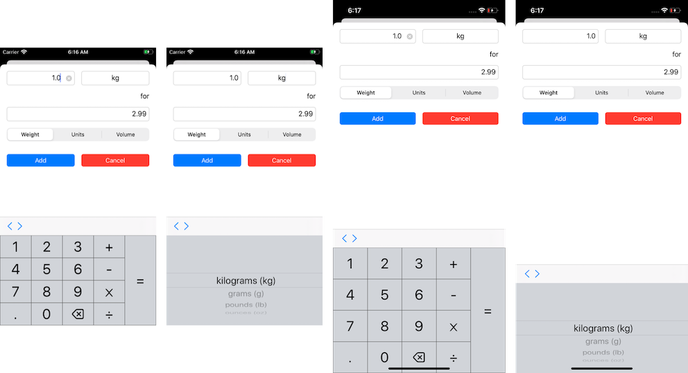
On Tuesday, I shared this image comparing the height of the two main input views (the calculator keyboard and the picker) in Per between an iPhone 8 and an iPhone 11:

I could explicitly set the height of both input views to something like 240 instead of giving it a .flexibleHeight auto-resizing mask, but that didn’t feel like the right approach. I asked about this in the Core Intuition Slack and Daniel Jalkut suggested I poke around in Xcode’s view debugger to see what’s going on there.
Here’s what I’ve been able to surmise.
I layout a custom input view like CalculatorKeyboard as follows (it’s really a set of nested stack views, but I’m leaving that out — details of the approach are from this Stack Overflow answer):
func setupView() {
    autoresizingMask = [.flexibleWidth, .flexibleHeight]
    addButtons()
}

func addButtons() {
    let stackView = createStackView(axis: .horizontal)
    stackView.frame = bounds
    stackView.autoresizingMask = [.flexibleWidth, .flexibleHeight]
    addSubView(stackView)

    // —code to layout all of the buttons goes here—
}
This basically just sets the frame of the custom keyboard to that of the system keyboard’s bounds. Note that it doesn’t do anything to add a safe area inset at the bottom of the keyboard. The view debugger tells me this is 375×291 on an iPhone 11 Pro, and 375×216 on an iPhone 8, a difference of 75 points.
I’m way less specific about setting the frame of the picker. In fact, I just set:
textField.inputView = pickerView
and call it a day. The view debugger tells me its size is 375×216 on both iPhone 11 Pro and iPhone 8 — the same size.
I’m getting closer here. I think part of this has to do with the intrinsic content size of the custom keyboard vs the picker, and also that I should probably be doing more in the parent view controller than just hoping things work out with autolayout in the views.
I’ll dig deeper on this tomorrow!
