The Per Rewrite Diary: Day 12
Posted on by Angelo Stavrow
This post is part of a series about rewriting my iOS app, Per. Per is a price per unit comparison app with a bunch of neat convenience figures, but it hasn’t been updated in years, so I’m rewriting it from scratch to eliminate a bunch of technical debt. Just because it’s not an open-source app doesn’t mean I can’t share what I learn as I go!
See the rest of the series here.
In The Details
On Monday I worked on a plan for the week. I tackled a simple clear-the-list feature yesterday, and today I’m going to start —but probably not finish— work on the product detail view(s) that let users enter, uh, product details.
Again, some planning is worth the effort before jumping into writing code. The goal of this part of the rewrite is to get something functional up and running before doing any custom design, and to learn, but making it easy to change a codebase is more invoved than you’d think.

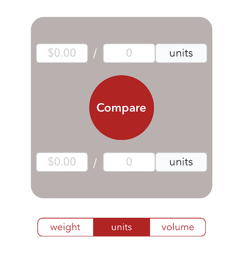
In its current form, a product is entered into Per as a set of three text fields, as shown. And it’s… not wonderful.
The design sacrifices a lot for the sake of compactness — in my initial sketches, I wanted Per to handle as much input as possible in a single view, to make it very quick and easy to get in and out of the app while, say, doing your groceries.
For v2, users aren’t limited to comparing two products, so we necessarily need a separate view for product entry. This gives me a lot more room to breath, as it were, so starting off with three sets of label-plus-textfield input areas is a good start!
This is where stack views are super helpful. I feel that flexbox is a good analogue to stack views in the web development world; you create either a row or a column of views and align them along the main and cross axes according to some rules, and voilà! You have a basic layout. And you can nest stack views, for something like this:
+------------------+   ^
|                  |   |
+------------------+   |
|                  |   |
+------------------+  Vertical stack view
|                  |   |
+==================+   |
||       ||       || <-+-- Horizontal stack view
+==================+   V
Tomorrow, I’ll start implementing something like this by putting the existing Add and Cancel buttons in a horizontal stack view.
